Your website homepage should articulate a clear problem you solve for a specific audience, showcase your unique approach, and establish why you are the obvious choice, rather than listing services or features. It acts as a filter, attracting ideal clients by speaking directly to their core challenges and repelling those who are not a fit.[1][2]
The goal is to move visitors from curiosity to clarity, making the next logical step evident. Most expert homepages fail not because they lack information, but because they lead with credentials and services instead of the client's problem. When a visitor lands on your page and immediately sees their own struggle described clearly, they stay. When they see a list of what you do, they leave.
A well-structured homepage answers three questions in sequence: What problem do you solve? How do you solve it differently? What should I do next? Everything else is secondary.
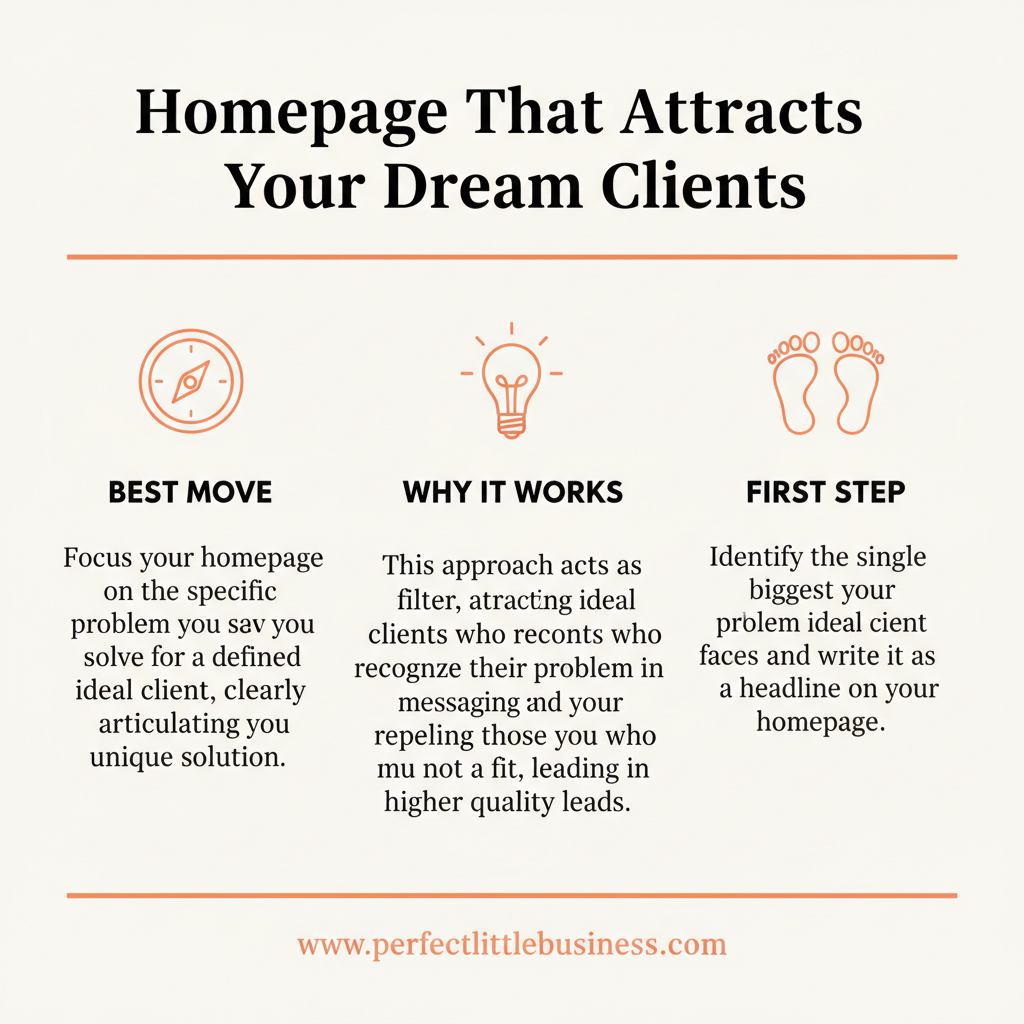
- A homepage is a filter, not a brochure; it should attract the right clients and deter the wrong ones.
- Lead with the client's problem, not your solution or services.
- Clearly articulate your unique perspective or methodology.
- Showcase authority and social proof subtly, not boastfully.
- Guide the visitor to a single, clear next step.
- Simplicity and clarity outperform complexity and jargon.
See how AI understands your expertise
The AI Alignment Reading reveals where you are visible, where you are missing, and what to fix first.
Get Your AI Alignment ReadingHow do I identify the 'single biggest problem' for my ideal client?
Identifying the single biggest problem requires deep empathy and research into your target audience's pain points. This is often not what they say they need, but what they truly struggle with.[1]
Steps to Identify
- Review past client testimonials: Look for recurring themes in their 'before' state.
- Conduct client interviews: Ask open-ended questions about their frustrations and aspirations.
- Analyze market conversations: What are people complaining about in forums, social groups, or competitor reviews?
- Consider the 'unspoken' problem: Often, the real issue is deeper than the surface-level symptom (e.g., 'lack of leads' might be 'feeling invisible in a noisy market').
What is the ideal structure for a problem-focused homepage?
An ideal problem-focused homepage structure guides the visitor through a narrative that resonates with their experience and offers a clear path forward.[2]
Recommended Flow
- Hero Section: Problem-focused headline and clear value proposition.
- Empathy Section: Acknowledging their struggle and demonstrating understanding.
- Your Unique Approach: How you solve the problem differently.
- Results/Proof: Testimonials, case studies, or social proof.
- Call to Action: A single, clear next step (e.g., 'Discover Your AI Alignment').
- About/Authority: Briefly establish your credibility without being self-aggrandizing.
How can I make my homepage messaging concise and impactful?
Concise and impactful messaging comes from ruthless editing and focusing on the client's perspective, not your own.[3]
Key Principles
- Use active voice: 'We transform businesses' instead of 'Businesses are transformed by us.'
- Eliminate jargon: Speak in plain language your client understands.
- Focus on benefits, not features: What outcome does your client get, not just what you do.
- One idea per sentence: Avoid complex sentences that dilute your message.
- Test headlines: A/B test different problem-focused headlines to see which resonates most.
How should social proof be integrated without sounding boastful?
Social proof should be integrated as evidence of transformation, not as a list of accolades. It supports your claims by showing real-world results for others like your ideal client.[1]
Effective Integration
- Short, impactful quotes: Highlight specific results or feelings.
- Problem-solution testimonials: Show the 'before' and 'after' transformation.
- Video testimonials: More authentic and engaging.
- Subtle placement: Integrate within sections that discuss results or your unique approach, rather than a dedicated 'bragging' section.
- Focus on client's words: Let their experience speak for itself.
What is the 'single, clear next step' a homepage should offer?
The single, clear next step should be the most logical, low-friction action a qualified prospect can take to move closer to a solution. It is designed to deepen engagement, not close a sale immediately.[2]
Examples of Effective Next Steps
- AI Alignment Reading: A diagnostic tool to help them understand their current state.
- Download a specific guide: A resource directly related to the problem you address.
- Watch a masterclass: An evergreen workshop that introduces your framework.
- Schedule a clarity call: Only if your service requires a direct conversation early on.
Avoid offering too many options, which creates decision paralysis.
Most experts design their homepage as a digital business card, listing services and hoping visitors connect the dots. This is a missed opportunity. A homepage should function as a sophisticated filtering mechanism, designed to repel unqualified leads and magnetize ideal clients by speaking directly to their deepest frustrations. It is about legibility to the right audience, not just visibility to everyone.
By leading with the client's problem and offering a clear path to clarity, you engineer a sovereign client journey. This aligns with the principle that clarity is the new growth hack — and allows you to attract leads without chasing.
This is exactly what we help our clients do at Perfect Little Business.

Founder, Perfect Little Business
Cindy Anne Molchany is the founder of Perfect Little Business. Since 2015, she has designed and built over 70 online programs for clients that have collectively generated more than $100 million in revenue. She helps established expert founders build intelligent, human-first businesses that attract ideal clients, command authority, and create leverage — without performing for algorithms or chasing endless scale.